- Communication Strategy
- Creative
- Digital
- Web Design & Development
Celebrating Warmth
Status Heating are a family run business, who take care of gas central heating installations and repairs for residential properties. They pride themselves on offering the highest level of personal service, with a customer-first approach, and unrivalled levels of care and expertise.
To celebrate the company’s milestone 50th birthday this year, it was decided a logo refresh was in order to give the brand a more modern feel, to be more representative of their mission and vision, and set the company in good stead for the next 50 years to come!


The Adventure
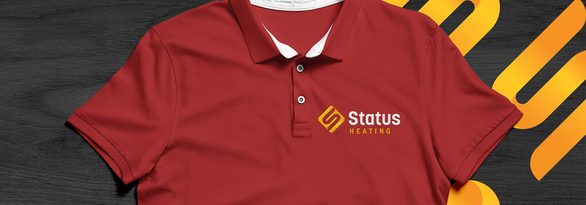
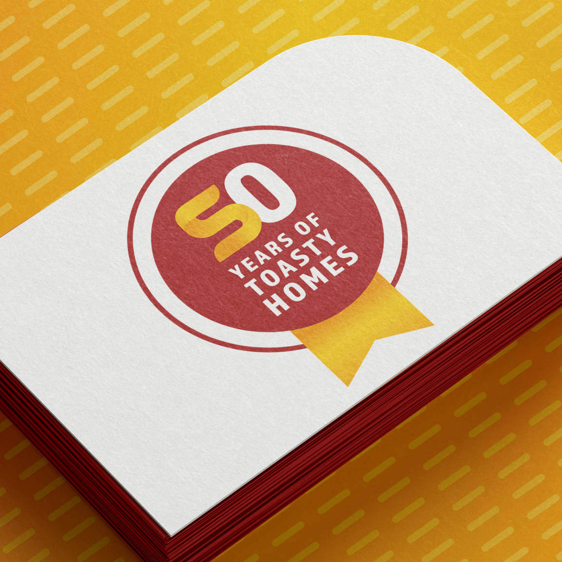
Status Heating are well known for their fleet of red vans, so it made sense for the core red to stay as part of the colour palette. We picked a vibrant orange and yellow to for to add contrast and warmth – reflective of both their product, and service. We crafted a new logo in the style of pipework to form the letter ‘S’, bringing in soft gradients for depth and character. The pipework graphic was adapted to form a celebratory ‘stamp’ to celebrate their 50 years of business, to sprinkle across their marketing channels for the whole of 2023!
From the outset, CUDOS were positive and eager to create us a fresh and modern logo and branding to replace our existing, dated look. Throughout, the team were attentive and determined to make sure that their work reflected the attitudes and values of our business. The branding that they have produced is a marvellous mix of a modern sleek design, whilst still making a nod to our brand heritage.

The Destination
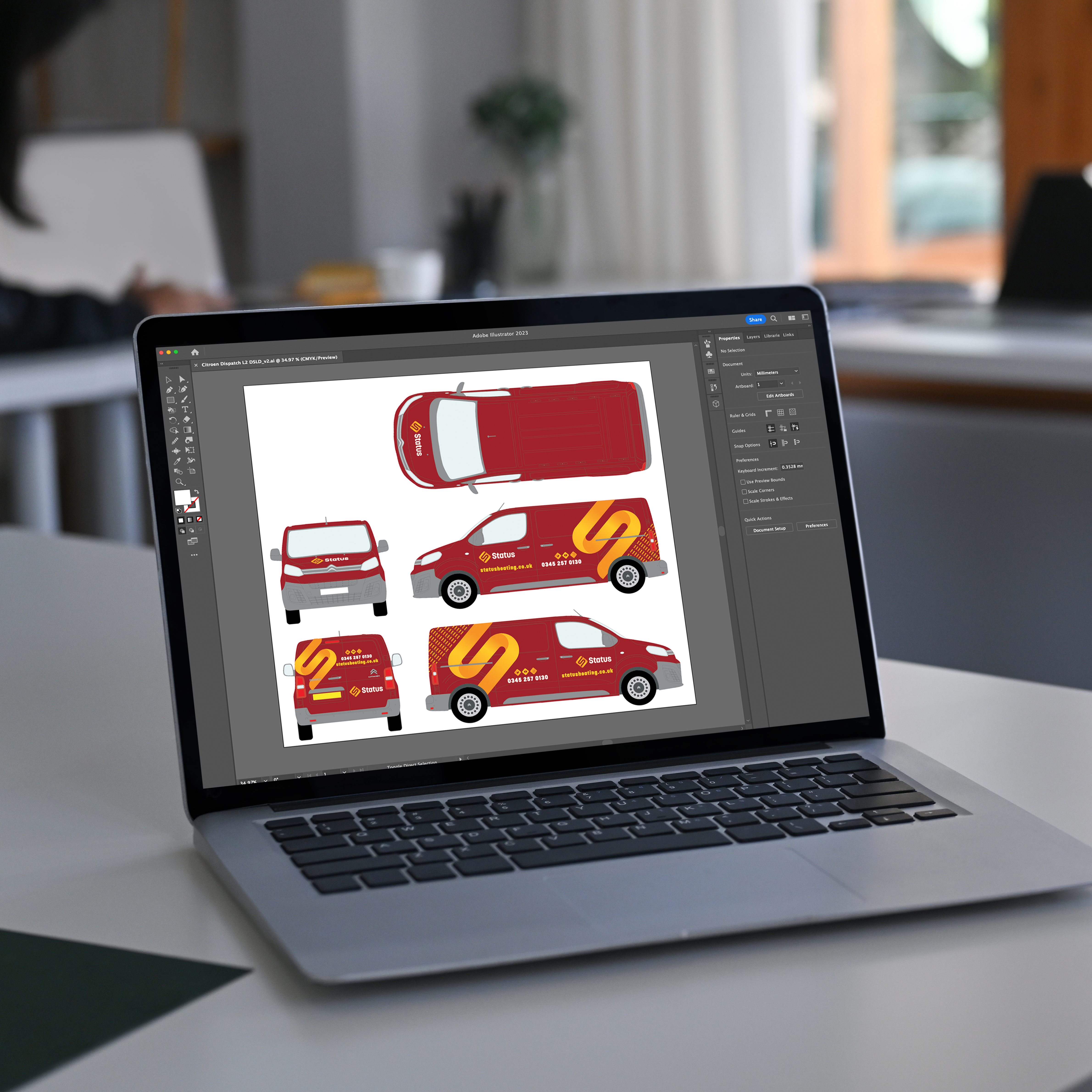
Status Heating have a sleek modern logo design and accompanying brand assets that really bring their image up-to-date after decades of the dated ‘swoosh’. Further assets were created to roll out the new look, with email signatures and van livery designs (still in the iconic red!). The brand has a more aspirational feel, to better attract and retain a new target audience, and to enable the company to move forward with a brand they feel proud of and excited by.

