
Strong brands don’t happen by accident. They start with values, grow with consistency and shine through every colour, font and swoosh. Building a strong brand is like baking a magnificent cake – get all the ingredients right, and you’ll have a business that is irresistible to your ideal customers (and keep them coming back for more).
Values
Your values are your anchor. They show clients who you are, help you stand out and give you direction. But only if they’re real.
Top tips for values that actually work:
• Ditch the clichés – No one needs another ‘innovative and customer-focused’ line – make it authentic and meaningful.
• Keep it catchy – Make them memorable, not yawn-worthy.
• Live them – If you can’t act on them, they’re just fluff.
Stand Out
Be bold, brave and unforgettable. If you blend in, you’re in the danger zone!
Here’s how to stay front of mind:
• Research the field – Look at your competitors, spot the gaps and fill them your way.
• Stay consistent – Logo, captions, tone of voice – keep them aligned.
• Evolve – Same core, fresh ideas. As your business spreads its wings, ensure your brand identity expands with it to stay relevant and impactful.

Colour
Colour is instant emotion. The right palette makes people feel before they’ve even read a word – ensuring your brand sticks in the hearts and minds of your perfect customers. Examples of colours that tick:
• Blues = calm, trust, reliability (think NHS).
• Reds = energy, passion, fizz (think Coca-Cola).
• Greens = planet, people, purpose (think Friends of the Earth).
Pick colours that match your values, stick to clear hex/RGB/CMYK codes, and use them consistently.
Fonts
Fonts speak louder than words. Sleek serifs, bold displays, clean sans-serifs… whatever you choose, it sends a signal.
Quick wins:
• Don’t go font-mad – Use no more than 1–2 fonts max – too many looks messy and distressing.
• Say what? – Make sure they’re totally legible, and versatile too (with lots of weights and italics to make your comms clearer).
• Have permission! – Stick with a reliable source such as Google or Adobe fonts to avoid font police drama (yes, they do come knocking!).
Logo
Your logo is your brand’s face. Keep it fresh, meaningful and flexible.
• Less is more – Don’t overcomplicate (your poor branded pens will thank you). Keep icons / emblems simple and straplines to 3-4 words.
• Adaptability is key – Create versions for every use (print, online, colour, reversed) so you can be consistent, wherever you are.
• Build in meaning – Logos with a story stick harder. What is the one big thing you need your customers to know about you?
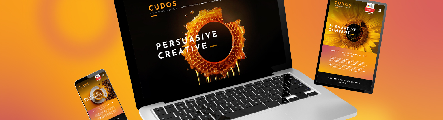
Supporting Graphics
A brand isn’t just a logo. It’s the shapes, scribbles, squiggles and sparkles that bring it to life. That’s where the magic happens.
• Iconic icons – Turn your services, sectors or values into icons for little visual nudges and smart signposting.
• Build a graphics toolkit – Patterns. Devices. Textures. The stuff that makes your content shout ‘this is us’ before a single word is read.
• And don’t forget the human touch – Your own photography. Your own illustration style. That’s what gives your brand its unmistakable character.
Tone of Voice
Your tone is how you turn clients into friends. It’s the spark that makes them want you, not just need you.
• Know your audience – You can’t be mates if you don’t know who they are.
• Keep it consistent – From emails to Insta posts, your voice should sound like you every time. That’s how trust builds.
• Match your personality – Playful, mischievous, caring, disruptive…Whatever vibe you want to give off, own it.
Brand Guidelines
Think of brand guidelines as your brand’s survival kit. They keep everything tidy, on track and unmistakably you. Without them, things unravel fast – wrong colours, dodgy fonts, off-key tone. With them, you’ve got clarity, consistency and clout.
What they should cover:
• Logo rules – Placement, sizing, what not to do.
• Colour palette – Exact hex, RGB and CMYK codes.
• Fonts – Which ones, in which weights, and where.
• Tone of voice – How you sound in emails, on socials, in pitches.
• Imagery + graphics – Photography style, patterns, icons, doodles.
Get it down in one place. Share it with your team, freelancers, printers, web devs – anyone touching your brand. That way, whether someone’s making a billboard or a business card, it all looks, feels and sounds like you.
So there you have it. Values, colour, fonts, logos, tone of voice, and brand guidelines. Build them right for a brand that won’t just show up – it’ll show off.