
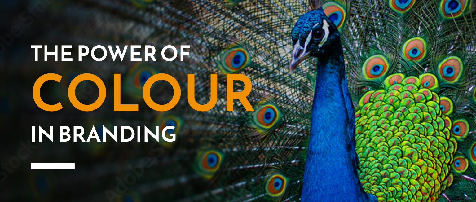
How to use colour psychology to build a brand that connects
Deciding on the right colour for your brand can feel overwhelming. But understanding colour psychology in branding can make it a whole lot easier. It explains why certain shades make us feel a certain way – and how those emotional triggers can help you make smarter design choices that connect with your audience.
Colours trigger emotions. Red, for example, instantly grabs attention and prepares us to take notice. Blue, on the other hand, feels calm and trustworthy, which is why it’s often seen in healthcare or corporate branding. Each colour has its own story, and the right one can say a lot about your brand before anyone reads a word.
Think about how you want people to feel
When you’re choosing colours, focus on how you want your audience to feel rather than simply picking shades you like. A bold red logo might be your favourite, but if you’re launching a new dental practice, that colour could create the wrong impression for an audience already anxious about visiting the dentist.
A cool blue or green, on the other hand, helps people feel relaxed and reassured. You might even mix in a gradient for a softer, modern touch. These tones evoke trust and harmony – perfect for a service built on care.

Look at your industry, then find your twist
It’s worth checking what colours are common in your industry too. If every other dentist has a blue logo, how can you stand out without losing that sense of calm? Maybe you add a touch of green for freshness, or a hint of lavender to bring warmth and friendliness. Small differences in tone can make a big impact on how your brand feels.

Build a colour palette
Once you’ve chosen your main colour, it’s time to build a supporting palette. This adds depth and flexibility across all your marketing – from your website and brochures to your social media templates.
A good rule of thumb is the 60-30-10 rule:
60% dominant colour (your main brand shade)
30% secondary colour (to balance and complement)
10% accent colour (to highlight and add contrast)
If you want to play around with combinations, try the Adobe Colour tool. It’s a brilliant way to explore shades that align with your brand personality.
Stay consistent
Colour is one of the strongest identifiers of a brand. Think of red and yellow together – you instantly think McDonald’s. That’s the power of consistency. When people repeatedly see your colours, they begin to associate them with you.
Make sure your colours appear everywhere: your website, social media, print materials, packaging and even your office space. Repetition builds recognition. Consistency builds trust.

Design with everyone in mind
It’s also important to make sure your colours are inclusive and accessible. Choose combinations with enough contrast so that everyone – including those with visual impairments or colour blindness – can engage with your brand easily. Dark text on a light background is always a safe choice. And try not to overload designs with too many colours; it can distract from your message.
Need a hand?
If you’re struggling to find the right combination or feel your brand colours no longer reflect who you are, we can help. Whether you’re starting from scratch or refining what you already have, we’ll help you create a colour palette that not only looks great but feels right too.