
- Creative
Bringing warmth, hope and humanity to Acacia Family Support
Acacia Family Support is a Birmingham-based charity offering free, compassionate support to families experiencing pre and postnatal depression and anxiety. Through listening, practical help and genuine human connection, its team helps parents feel understood, valued and less alone.
The Challenge
Acacia came to us with an established logo and a vivid colour palette. The work they do is warm, sensitive and deeply personal. But their identity did not always reflect that. The existing brand system felt chunky and quite corporate, which didn’t fit with the gentle, supportive nature of their services.
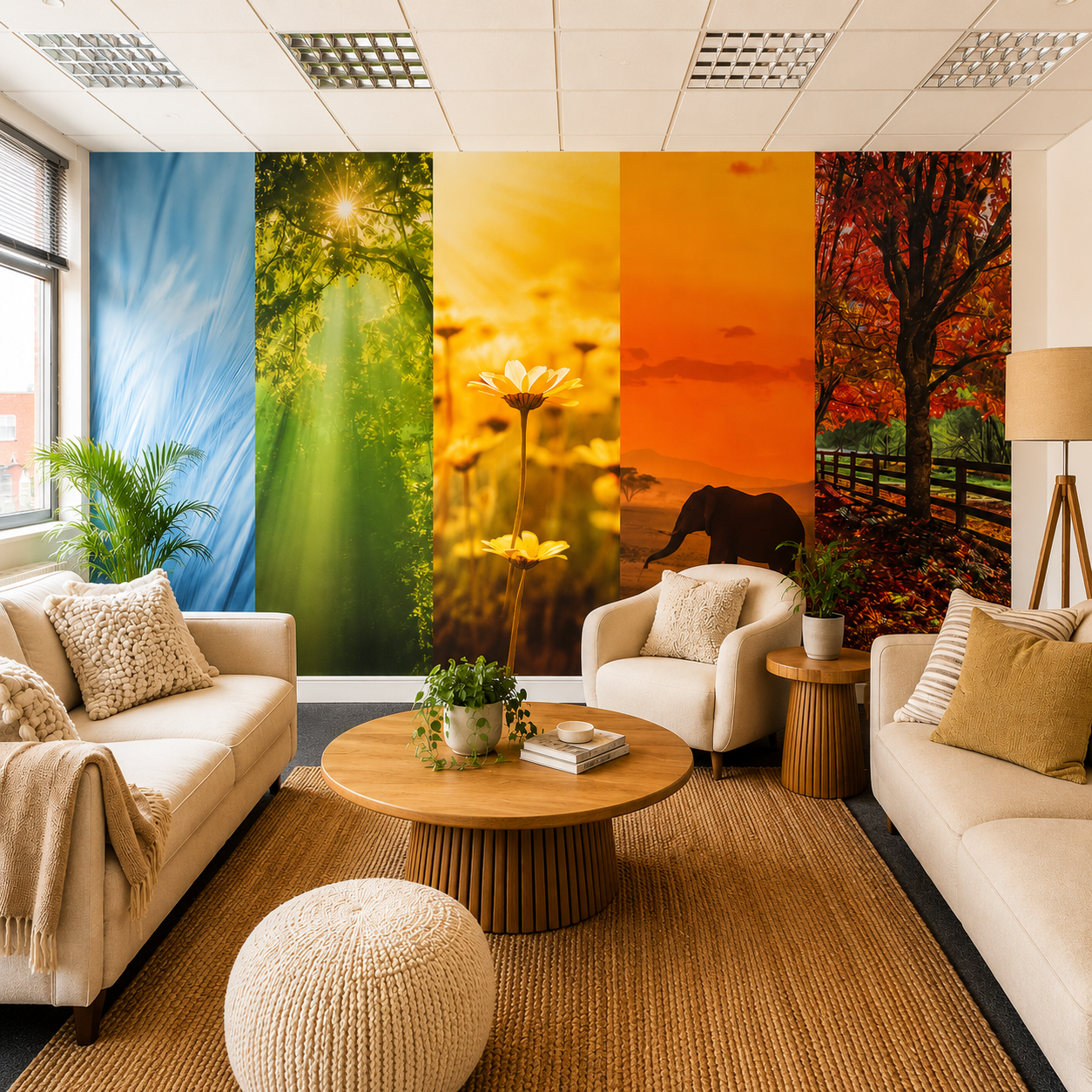
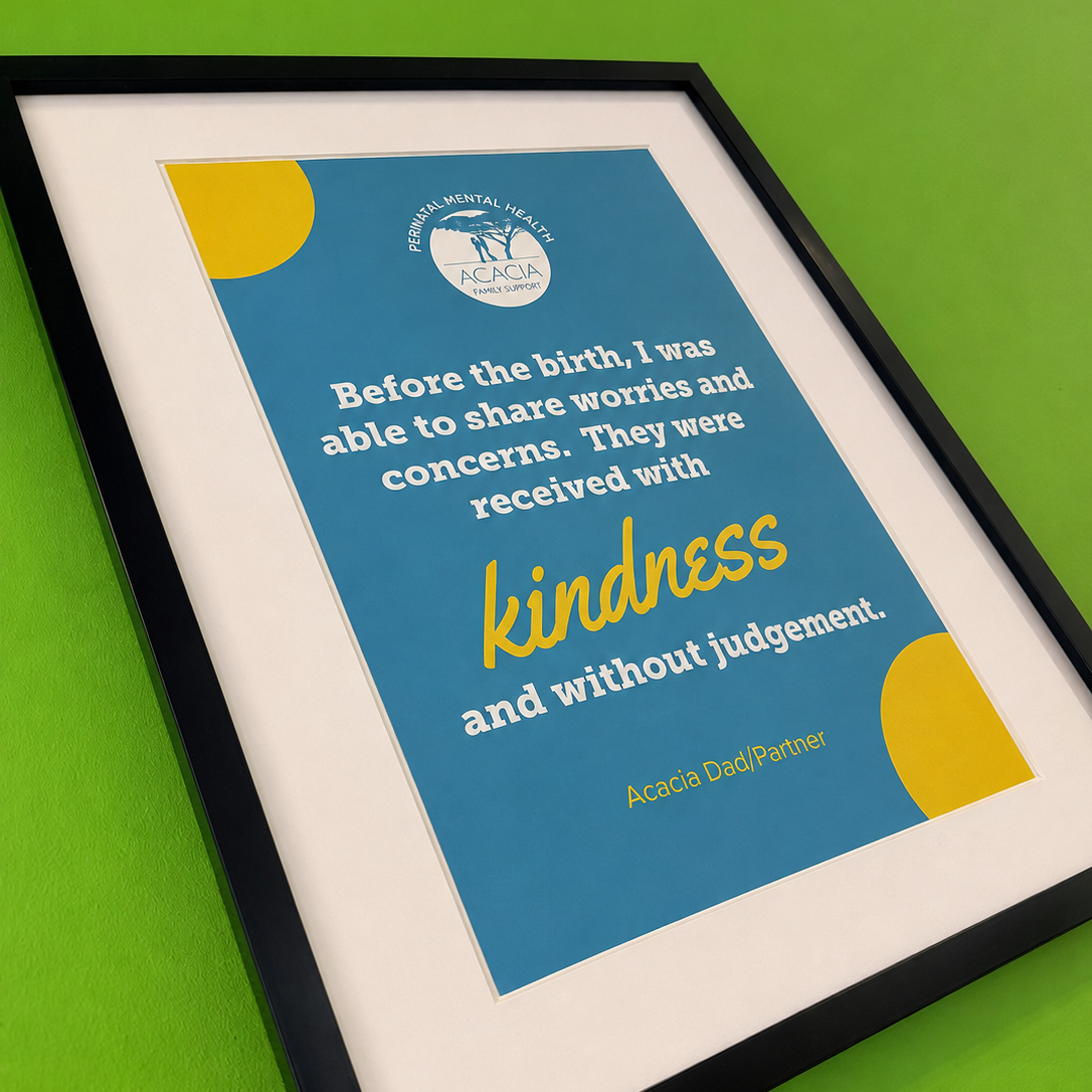
Our first task was to transform Acacia’s office space using wall graphics. We needed to work creatively within the existing brand, softening its brighter colours and finding a visual direction that felt calm, welcoming and reassuring. And much more Acacia.
Cudos Creative have taken the time to really understand Acacia, our values, and what makes us unique. As a result, the new branding they have created genuinely feels like us. They have given our branding a fresh, modern feel while keeping the heart and essence of who we are, which was incredibly important to us. They have also supported us in creating branding for new projects, while making sure everything feels cohesive and connected to our wider brand.
Finding calm within the colour
Through our initial conversations, we landed on nature as the creative thread.
Nature is calming, grounding, and full of hope and renewal. It also gave us a natural way to make sense of Acacia’s vivid palette because, when you stop and look, those bright colours appear everywhere within the natural world. Suddenly, the colours that had previously felt difficult to use had somewhere to belong.
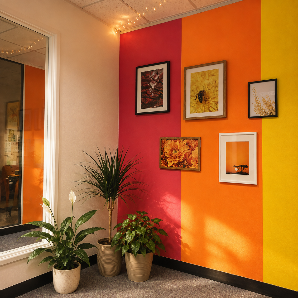
We created colourful nature-inspired wall murals for the family room, bringing energy into the space without making it feel overwhelming. For the events room, we designed a bold feature wall using blocks of Acacia’s existing colours, punctuated with framed nature photography to soften the overall look.
With the addition of plants, beanbags and bookcases, the room began to feel less like an office and more like a warm, welcoming and homely space where people could feel comfortable.
Creating identities rooted in real stories
From there, our attention turned to two of Acacia’s important projects, each inspired by a mother whose story holds deep meaning for the charity.
Emma was one of Acacia’s founders. Bluebells, her favourite flowers, became the heart of the identity created in her memory.
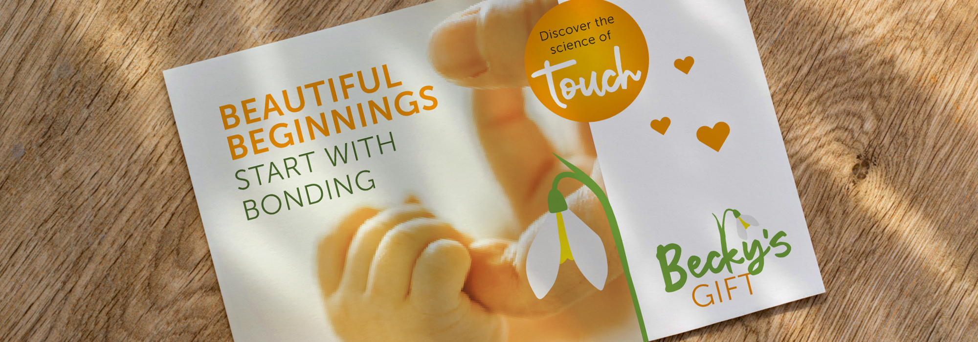
Becky and her family came to us while she was experiencing postnatal depression. This project features snowdrops, one of the first signs of spring and a powerful symbol of hope, resilience and new beginnings.
We developed two distinct but connected visual identities, giving each project its own story while ensuring they still felt part of the wider Acacia family.
A new typeface brought a softer, more human quality to the designs, helping the projects feel friendly and approachable while treating the meaning behind each one with the care it deserved.
Turning difficult feelings into a simple visual story
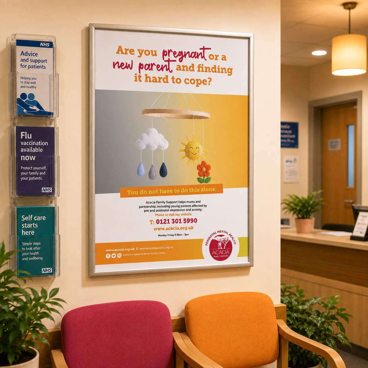
The refreshed styling was then rolled out across a series of posters for GP surgeries, created to help parents recognise when they may need support and encourage them to take that first step towards asking for help.
We wanted to communicate the emotional highs and lows of pre and postnatal depression and anxiety without relying on photographs of people. This helped us avoid visual stereotypes around gender, family structure and lived experience, ensuring the campaign could speak to every parent who might need Acacia’s support.
Our solution was a baby’s cot mobile. On one side, bright and sunny symbols capture moments of lightness. On the other, rain clouds represent the more difficult days. A simple, familiar object became a sensitive visual metaphor for a complex experience.
The outcome
What began as a project to bring Acacia’s office walls to life has grown into something much bigger.
The new creative direction has been so positively received that it has inspired Acacia to explore a wider brand refresh, giving the charity a warmer and more flexible visual language to use across its communications.
It now has a stronger platform for connecting with service users, sharing the stories behind its programmes and showing the compassion that sits at the heart of everything it does.
The refreshed branding also gives Acacia a more professional and meaningful way to communicate its impact to partners and funders, supporting future funding applications and helping the charity continue its vital work.
We found the warmth within a challenging colour palette and helped Acacia’s brand bloom.