- Creative
Devouring all things print
Print Monster aren’t just printers. They’re print obsessives. The team live and breathe it – from glossy brochures to enormous wall graphics, branded uniforms to pens, posters and expo panels. If it can be printed, they’ll find a way. Their superpower is next-level customer service and a ‘yes, we can’ attitude no matter how diverse the request. But their old brand wasn’t cutting it anymore. It didn’t match their ambition. It didn’t shout loud enough about their mission to be the go-to print company in the Midlands – the ones big clients turn to when they want it done, and done right. So it was time to switch things up with a new identity.

The Adventure
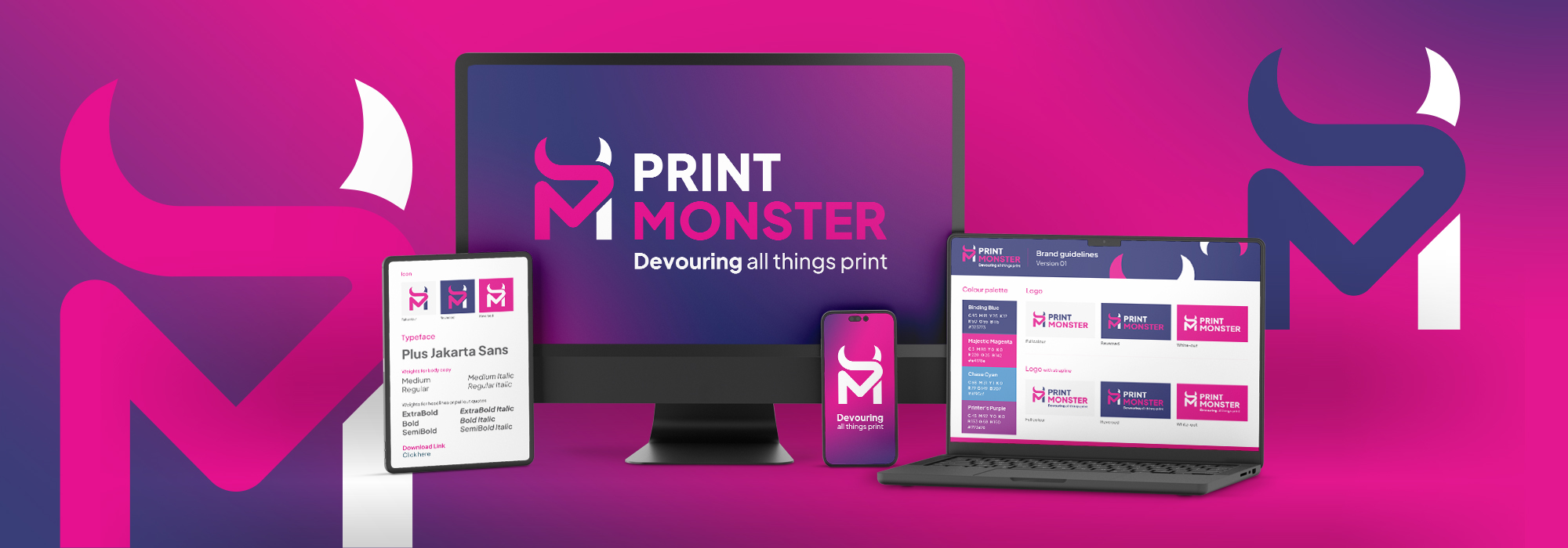
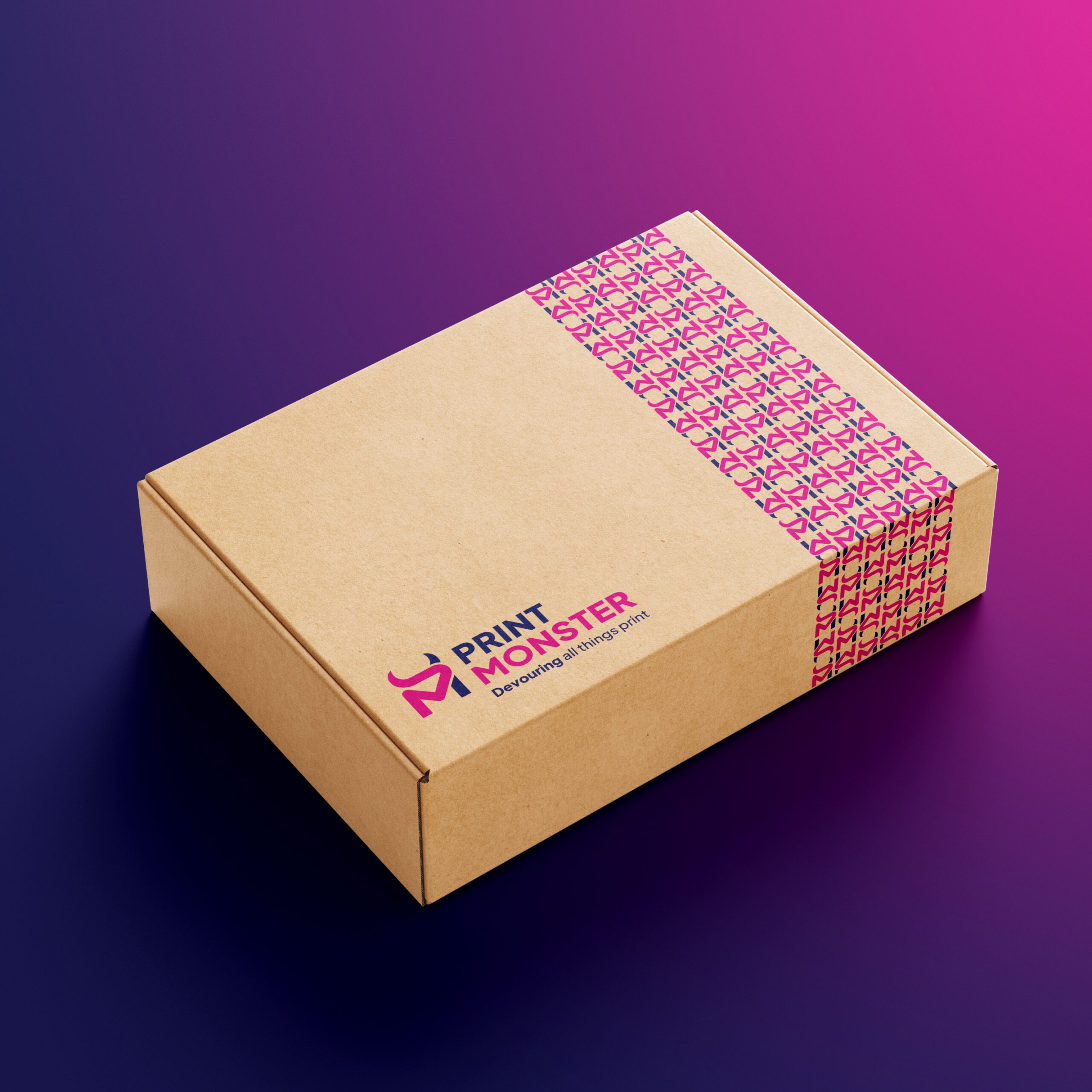
We spotted straight away that the name Print Monster was begging to be unleashed. While competitors played it safe, we leaned into the quirky to help them REALLY stand out. We created a bold new logo built on their initials, woven together with fluid lines that mirror the seamless journey from first call to final print. And then, of course, the quirky horns. A characterful nod to the ‘Monster’ without being too gimmick-y. Colour-wise, we forgot the obvious CMYK cliché. We pushed into rich blues, moody purples and a hot pink accent that brings vibrant personality. The new brand is now professional and slick, but playful and standout. Just like the Print Monster team. The final touch – the strapline beneath – ‘Devouring all things print.’
Our rebrand was all about updating our look to reflect who we are today, and Cudos delivered. They took the time to understand what we wanted our brand to say about us and created a fresh identity that captures PrintMonster’s ambition and personality. The process was smooth, collaborative, and left us with a brand we can use confidently moving forward.
The Destination
With a professional logo pack and brand guide, Print Monster looked like the heavyweight they’ve become. The new identity gave the team the tools to broadcast their story through online marketing, improved presentations, and printed collateral and merch, allowing them to communicate much more confidently. And clients are seeing Print Monster exactly as they should: bold, capable, and ready to take on the big jobs (whatever that may be!) across the Midlands and beyond. With many people commenting positively on the rebrand, it’s certainly been noticed by their ideal audience – which is precisely what we needed it to do.